Hologic is a medical device company that provides imaging, diagnostic, and surgical equipment for women’s health.
As a global company, Hologic needed to create a “content hub” to improve efficiency and consistency between their North American and European websites—while still allowing for flexibility to support differences in regulation and business needs across geographies. Having already worked with my FFW colleagues on the North America site, it naturally fit that Hologic would bring their EMEA team to FFW once again to build out this system.
In collaboration with Solutions, Visual Design, UX Research, and our client partners, I developed content strategies and design system extensions to scaffold the new hub structure and tackle several goals simultaneously:
- Hub framework and platform governance to localize and syndicate content across 11 country-specific sites, each with their own languages and regulations
- Consolidation of 400+ microsites into the main platform to improve SEO and brand architecture
- Information architecture and design components to highlight a new “solution selling” strategy including product line portfolios and persona-oriented bundling

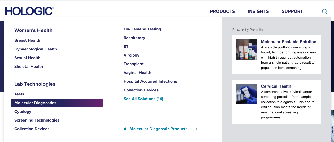
Expanding menu navigation
Hologic USA had very simple site navigation with dropdowns per product focus. While this design is straightforward and easy-to-use, it wouldn’t solve for EMEA’s new business strategy.

After discovery workshops, exploratory sitemapping and sketching, and finally designing, Hologic EMEA is thrilled with their new products megamenu. Healthcare providers exploring Hologic’s offerings can now see the full range of products in a single view, plus they have access to information about product portfolios and solutions that work together to deliver better patient outcomes.
Leveling up the design system
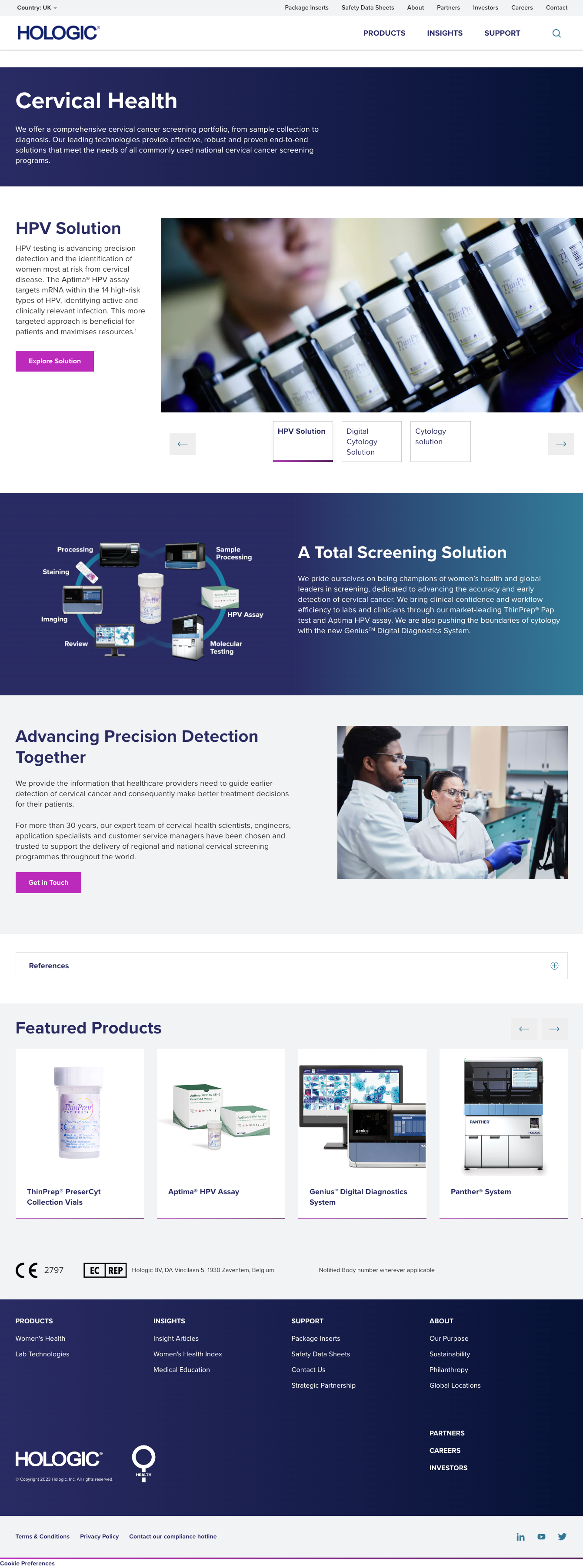
Supporting EMEA’s more complex solution selling strategy didn’t stop at the megamenu. We also needed to go beyond USA’s simple product listing pages to highlight the new solution and portfolio offerings, plus create engaging templates to show off full product suites. After working through the content hierarchy and conducting a gap analysis on the existing design system, I collaborated with our Visual Designers to lay out and refine components that would bring this strategy to life. Our expansions of the design system also supported microsite consolidation—with more design flexibility, the need to spin off a separate microsite for editorial control was reduced.


Applying the content lens in cross-functional collaboration
The most crucial part of this project was establishing and building the technical infrastructure to power the content hub. This is admittedly outside my area of expertise, but I played an essential role in ensuring the efficacy of the content while my Solutions and Technology teammates worked through systems, data integration, and hub architecture. I identified user priorities with jobs-to-be-done workshops, conducted discovery on content localization needs across country sites, influenced governance conversations, and supported the organization of product information and content translation across the whole system.

A little (okay, much) closer to my expertise is user research. I regularly partnered with our UX Researchers to identify areas of opportunity for testing, analyze results, and formulate strategic and design recommendations to improve the overall experience.


Results
In usability testing of the Hologic EMEA site prototype, participants had a 96% successful completion average across all tasks. The System Usability Scale (SUS) rating, which measures users’ perceptions of the system, was a 70.94, which falls into an above-average “B – Good” grade.
Plus, participants provided lots of positive feedback during the testing:
- “There are multiple ways to find things…you can specifically search for something or you’ve got categories to look for to find things, and it was all relatively intuitive.” – User 1
- “The navigation a between all the different pages is very clear and signposted very well.” – User 2
- “Having a cleaner drop-down is better than listing products out, and [the menu is] quite clean.” – User 4