CertainTeed is a leading brand of residential and commercial building materials, including roofing, siding, trim, insulation, gypsum, ceilings, and solar. With such a diverse set of product categories—most of which entered the company through acquisitions of specialized manufacturing companies—the CertainTeed website had a disjointed user journey, business-centered language and navigation, and outdated branding and visuals.
Guided by the company’s new “One CertainTeed” charter, my team at FFW and I were tasked with the most ambitious end-to-end redesign of my career: a group of clients eager to innovate (yet hesitant about change), multiple business units with similar user needs (but conflicting business goals, purchase methods, and perceived levels of importance to the company’s bottom line), dozens of product categories representing thousands of products and even more individual SKUs (and product pages attempting to cram every product detail above the fold)…and, oh yeah, enabling translation and localization across two countries and three languages, migration of a fully separate blog website into the main platform, net-new “solution selling” opportunities, integration between the PIM, DAM, and Drupal content model, and so much more.
I partnered with Solutions, UX Research, Visual Design, and our client stakeholders to create an exciting, beautiful new website that would live up to the “One CertainTeed” goal and help both B2B and B2C customers get the information they needed in the most linear journey possible. To do so, I focused on a few key areas:
- Balancing the uniqueness of each product category/business unit with the need for consistency and reuse across the system
- Identifying and presenting user-centered site navigation, taxonomy, and design components that match the user’s mental model with the site’s information architecture
- Refactoring the site’s “conversion” tools to educate users about the buying process and empower them to take the next step
Creating consistency within idiosyncrasies
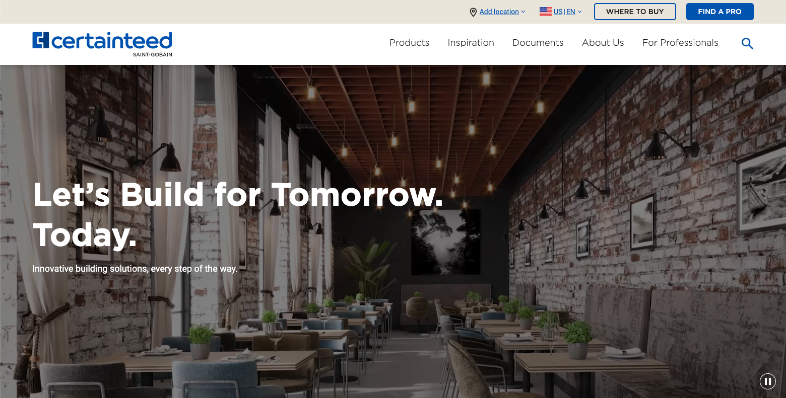
With so many products, a highly reusable design and content system was a top priority for our main client stakeholders. Their colleagues representing individual business units, however, wanted lots of customization tailored to highlight specific value propositions within their product categories.
To balance these goals, we focused on empathetic communication with both groups to determine shared business requirements and unite the groups behind the “One CertainTeed” strategic vision. We also had to be candid and consultative, regularly reinforcing the key finding from their UX research phase: users had more similarities than differences in their key tasks, regardless of B2B vs. B2C audience or residential vs. commercial product interests. We also took the extra step to populate mockup product pages with “real” content per business unit so each stakeholder could see how our designs would work for their unique needs (both real and perceived!).
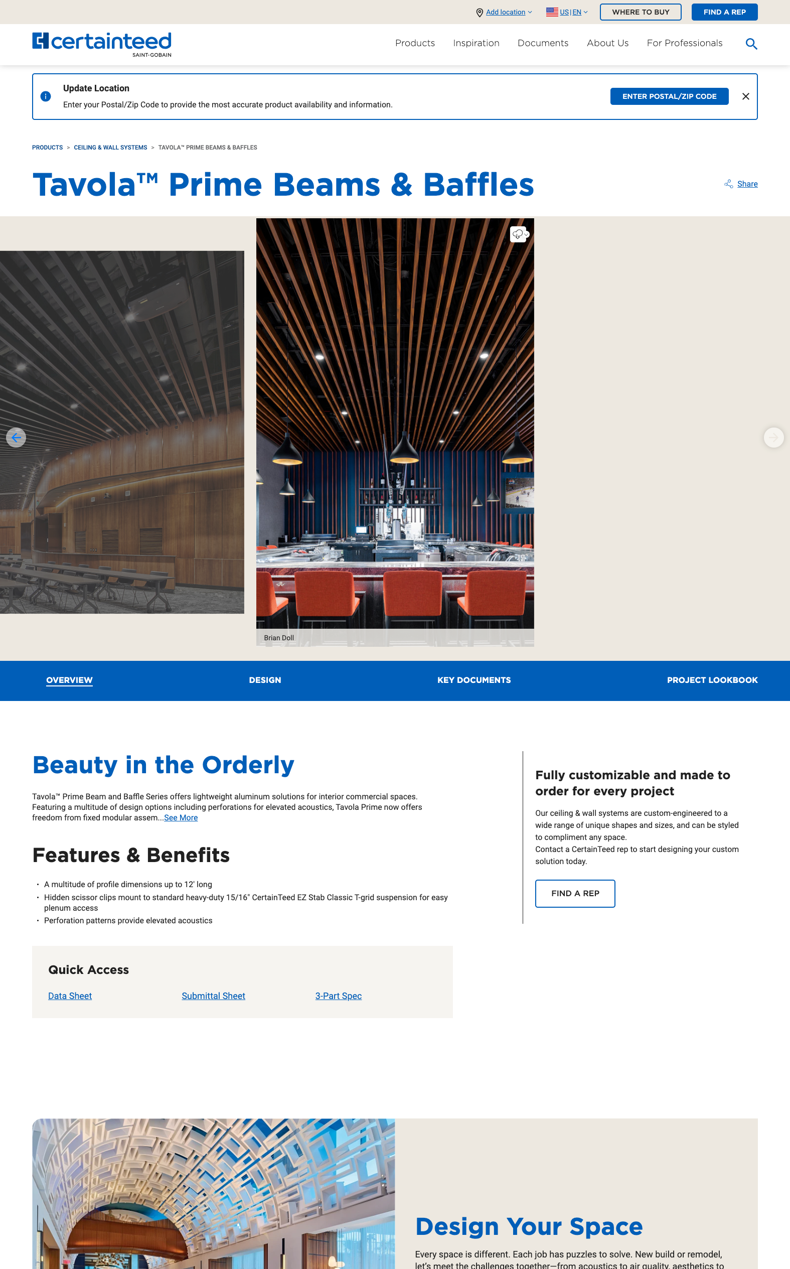
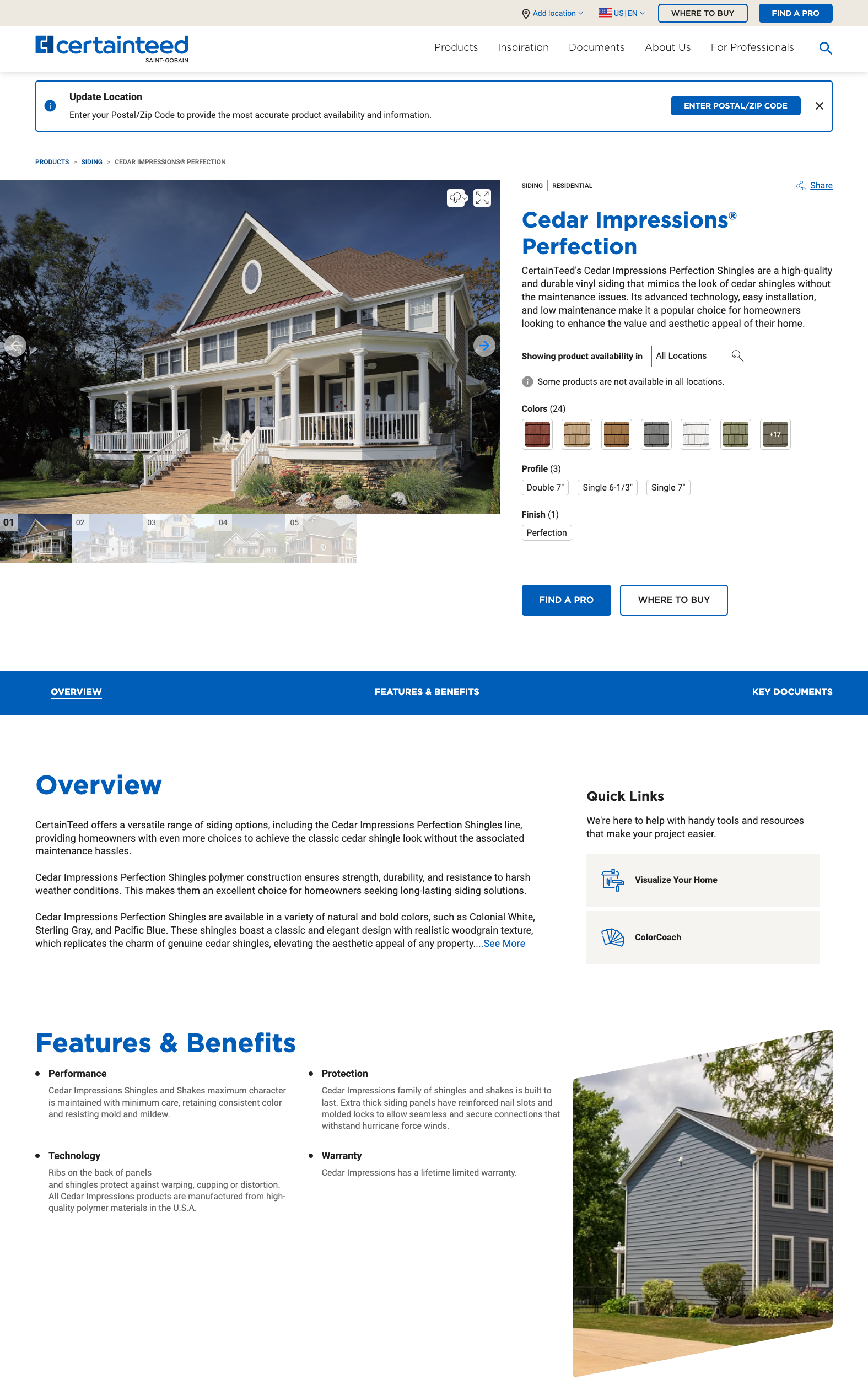
Beyond client communication, we also prioritized designing components that would be flexible across the platform—and yes, created a handful of component variations to meet some idiosyncratic needs and wants. For example, product detail pages across all categories would have a horizontal on-page navigation bar and a side-by-side “intro” and “sidebar highlight” section just underneath, but Ceilings pages needed a “visual forward” hero section to meet the expectations of their architect audience rather than the standard product image, description, variants, and availability that was crucial to balance homeowner and contractor priorities in all other product categories.
Letting users navigate the site how they want—and understand
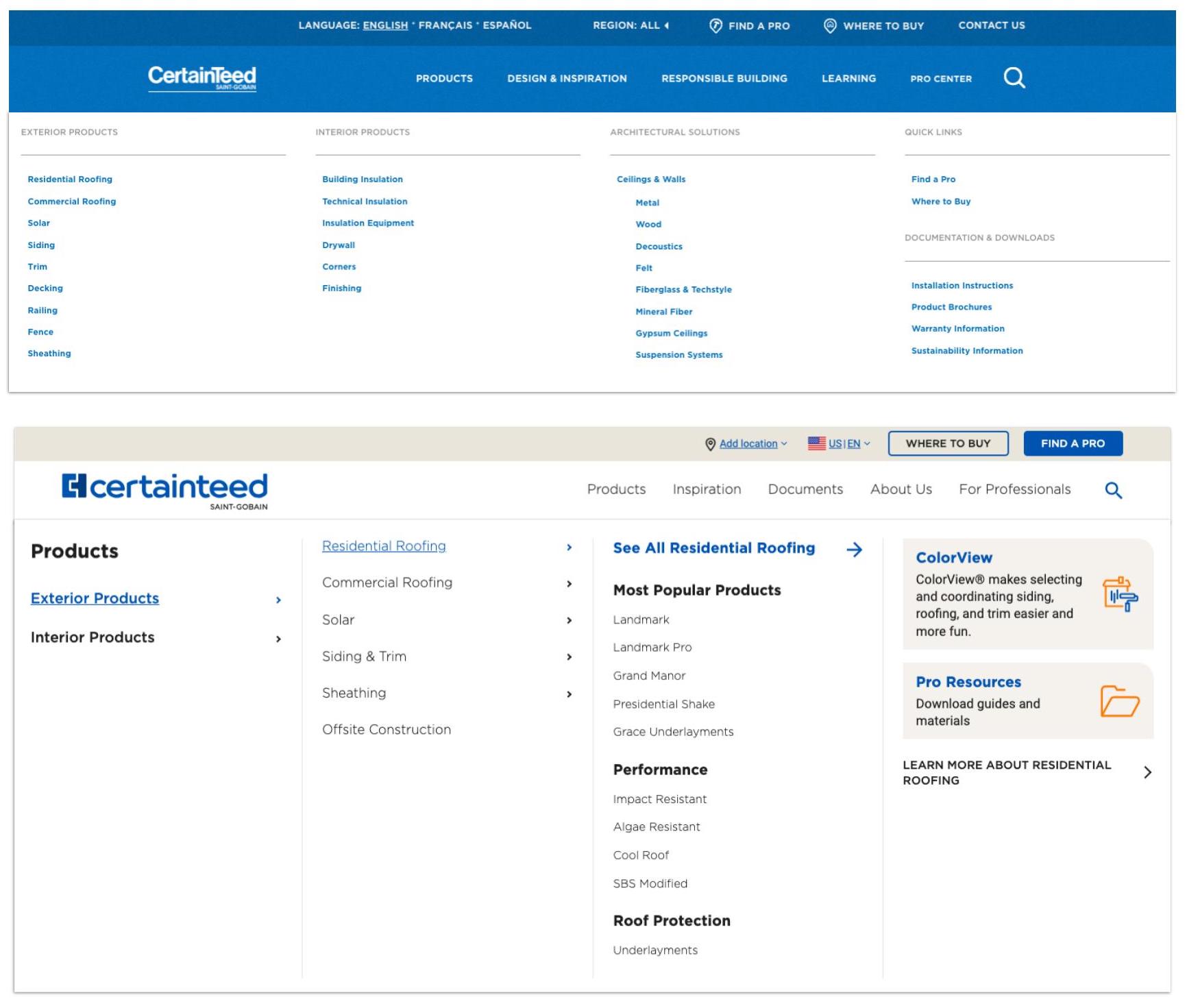
In the pre-redesign usability tests, users struggled to use CertainTeed’s existing megamenu to find the products and information they were looking for. The terminology was confusing, product categories reflected business unit structure rather than user mindsets, and the near total lack of hierarchy made it difficult to accomplish key tasks or understand how to start exploring.
The new megamenu allows any user—homeowners or professionals—to jump straight into the content that best matches their individual journey, whether they’re ready to learn more about a specific product, still seeking broad inspiration for a building project, or needing to download a specific document to complete paperwork.
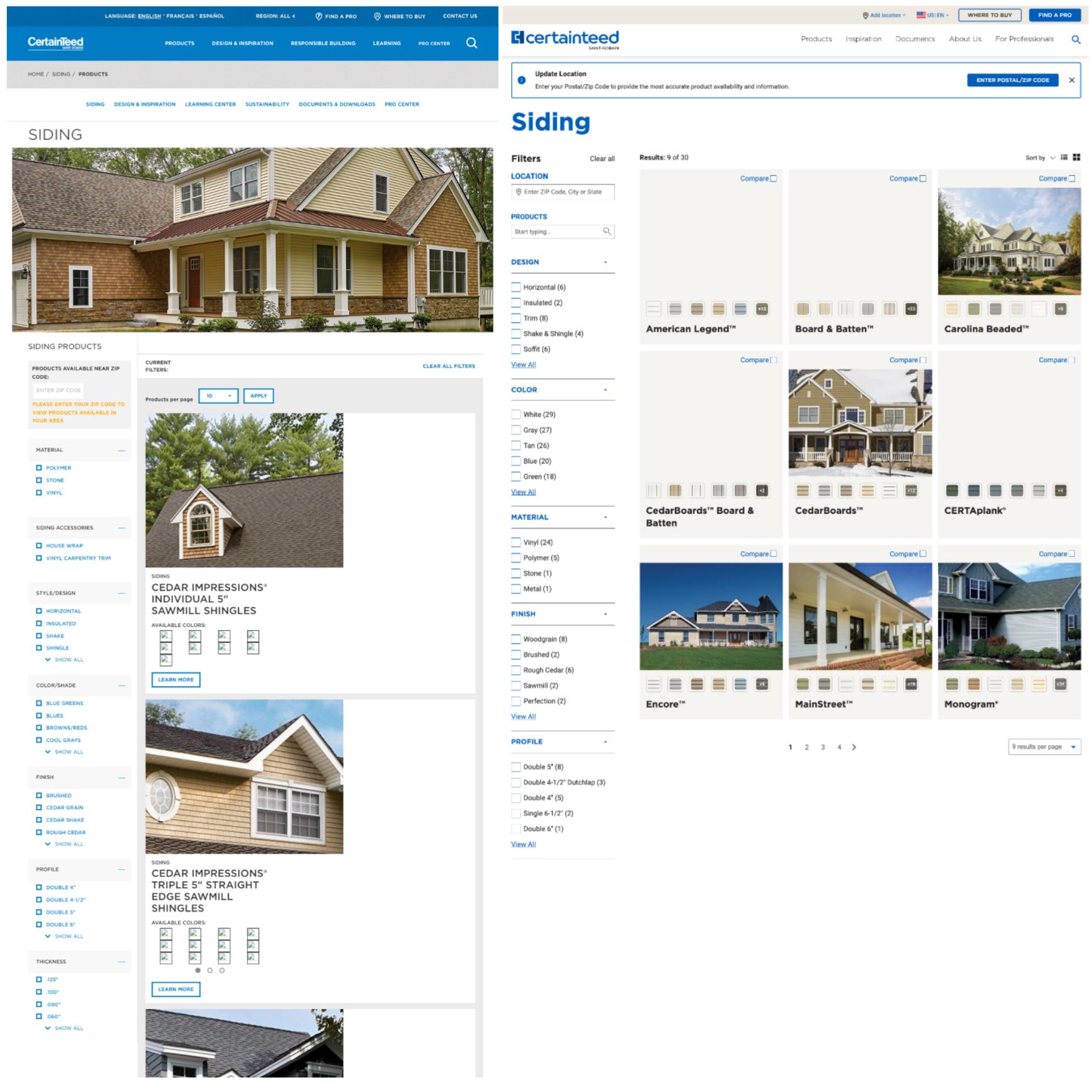
On a site with so many products, helping users narrow down choices is just as important as expanding their options—if not more so. After closely partnering with stakeholders from each product category, our revamped taxonomy removes overlapping terms between product categories to avoid confusion, updates vocabularies with customer-oriented (rather than company-driven) language, and establishes a hierarchy on product listing pages that reflect the most common customer priorities to streamline their buying journey. For example, most siding customers are most interested in design, then color, as their primary deciding features—not material—and within color, base terms like “gray” are easier to understand than variations like “cool grays.”
We also added a feature to allow for quick searching from the product listing page, reflecting a common user journey in which a customer already knows the product name they’ve discussed with their contractor but have come to the website to select a color. With expanded functionality, the system offers more flexibility and customization so each user can navigate their way.
Streamlining—and expanding—the “conversion” process
Despite the number of products on CertainTeed’s website, users can’t actually buy any individual SKU directly from the company. Instead, depending on the audience and the product category, their options are to connect with a contractor (if they don’t have one already), purchase through a local distributor, or visit a retailer that stocks CertainTeed.
Sounds simple enough, but it gets more complicated. Homeowners almost always go through a contractor, except in some product categories that are DIY-friendly (like Fence) and thus have retail availability. No biggie! We just map the buying options to the product and vary the CTAs on product pages. “Find a Pro” dominates most pages, with “Where to Buy” as an add-on option. Except!! Canada has more products that are allowed to be sold in retail, so now we also need to map which products need localized buying options. Plus!!! Contractors might be looking at the same product pages, so even though homeowners are the most common website users, “Where to Buy” now needs to be present everywhere—but not confuse the homeowner, who may not actually be able to buy the product directly and thus get frustrated and call customer service. And in some product categories that are not very homeowner-oriented, should “Where to Buy” supersede the usually-dominant “Find a Pro,” since they’re geared toward the contractor audience? Oh, and just one more thing: Ceilings, as usual, do it completely differently: the “Find a Rep” tool is the right path for architects doing custom ceilings projects, but there are also some commodity ceilings that come as-is, and thus need “Where to Buy” too. Phew!!!!
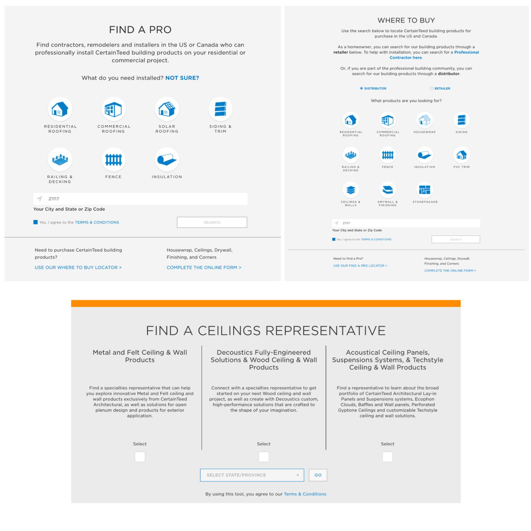
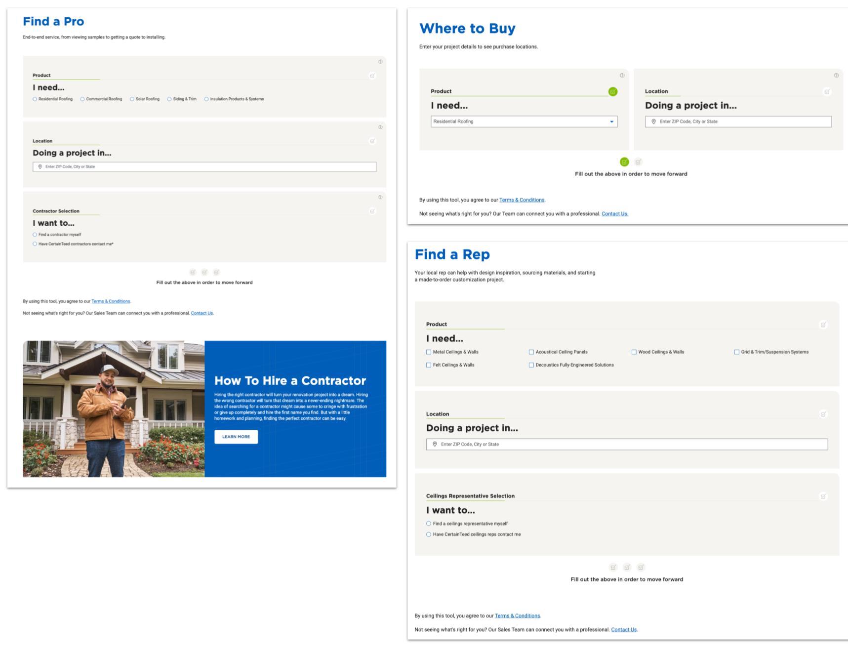
Educating customers felt like the right way to smooth this tangled conversion mess. We pitched a “Buying Process” component that could be customized per product page, but the client decided this type of content felt too “in the weeds.” So where else could education happen? The tools themselves! Instead of customers, especially homeowners, having to magically intuit whether their product might be in retail stores or would only be available through a contractor, we made the tools more interactive upfront to strengthen the ability to self-serve end-to-end.
The new tools have several major improvements:
- UX writing that establishes expectations upfront and provide a mix of education and hand-holding to get users what they need
- Functionality that captures and pre-populates information that the system already knows about a user’s journey, like the product type they were browsing immediately before clicking the CTA and the user’s zip code if previously entered, to minimize friction where possible
- Real-time system outputs to users’ form inputs, providing tailored purchase options based on information entered and allowing users more control over their own conversion process.
Results
In usability testing of the CertainTeed site prototype, participants across role types had a 72% successful completion average across all tasks, a seemingly small 5% increase compared to the pre-redesign benchmark testing. They perceived the platform as much easier to use, however, as measured by the System Usability Scale (SUS). The new platform yielded an average score of 79.17, an A- grade, a dramatic jump from the benchmark testing’s 65.54, a D grade. When asked for their overall impressions, most participants used words like simple and easy to navigate, intuitive and straightforward, and pretty and friendly.
Given the enormous scope and intense complexities of this project, I was especially proud to receive positive feedback from our primary client contacts.
The Manager of Digital Products sent the following to our account manager: “Sabina, Katrina [Solutions Consultant] and Amanda [Lead Content Designer] are the rockstars on this team when it comes to presenting, leading workshops and providing clear expectations. The rest of the team is super talented too, but the ladies stand out as the ones who run very smooth meetings that we don’t have to follow-up on and add post-clarity to the [business units].” Especially in a project with so many distributed stakeholders, it’s crucial to help our clients manage their “clients,” and I’m thrilled my colleagues and I could smooth that path for them.
I also received the following personal message from our client-side lead and Director of Digital Marketing: “I was continually impressed by your thoughtful approach to working through design challenges, Sabina. Thank you for all the heart and creativity you put into this project!”
CertainTeed.com also won the Saint-Gobain 2024 Digital & IT Awards in the Customer Engagement Category. Our IT leader client wrote, “The Digital & IT Awards is a prestigious award inside Saint-Gobain that is given out each year to select projects that truly transform the digital landscape. In 2024, there were 224 incredible submissions, but our project truly stood out, and we couldn’t be happier to celebrate the success…this win is a testament to the amazing work our collective team did!”
Truly, the number of challenges we faced was matched only by our commitment, dedication, and creative thinking in wrangling them—and it showed!